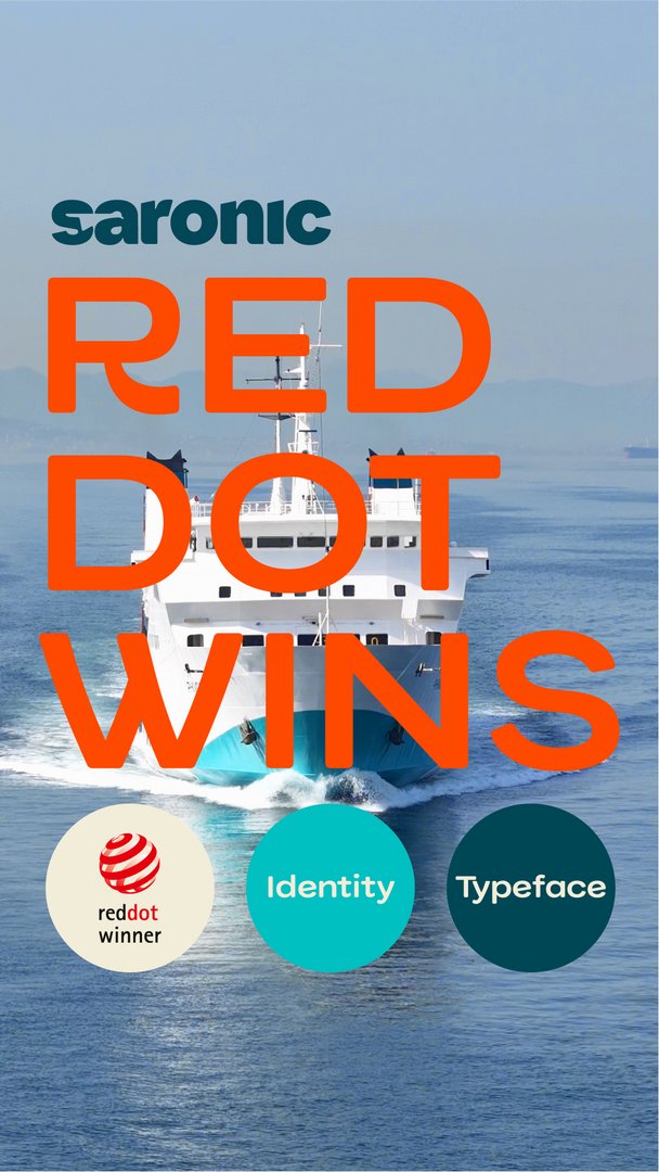
Saronic Ferries has won two important awards at the Red Dot Awards 2025, one of the most prestigious international design institutions.
The company won awards in the Brand Design & Identity and Typography – Typefaces categories, in recognition of the rebranding that was implemented and applied to the entire fleet in the summer of 2025.
The Red Dot Awards are a global benchmark for high-quality design. The jury recognizes projects that stand out for their concept, aesthetics and impact on the public. And for Saronic, this distinction is a confirmation of its deep connection and steadfast commitment to the Saronic.
“Recognition by the Red Dot Awards is a moment of pride for us,” says George Papaioannides, founder of Saronic. “It is not just a brand that is being awarded; it is a journey that has been going on for three generations. A relationship with the Saronic built with consistency, investment and true love for the islands and its people.”
A brand born from our values
The new Saronic brand, created especially for us by G Design Studio, is based on what the company has expressed for decades: reliability, care and an authentic relationship with the Saronic.
At the center of the new identity is Artemis, the seagull that we have all seen following our ships.
Artemis, a familiar presence for passengers, the bird that flies sideways, that many have fed and that connects the journey with a small moment of freedom, is the symbol of companionship, expressing the essence of Saronic: to always be by the traveler’s side.
The soft lines of the logo, the island-inspired colors and the warm illustrations create a familiar, friendly experience.
The brand does not aim to impress; but to accompany the passenger, making the journey simpler, more beautiful and more human.
The new Saronic font: our common “voice”
The second distinction concerns the new, exclusively designed Saronic font, also the work of G Design Studio.
With soft curves and calm lines reminiscent of the flow of the sea, it renders Greek and Latin with clarity and a warm, modern character.
It is used everywhere — on signs, on tickets, in applications — facilitating passenger navigation and making the experience clearer, more coherent.
“The new brand does not just change our image,” says Iosif Lefakis, co-founder of Saronic.
"It is the way to show outwardly what we have been doing for years: serving the Saronic Gulf with dedication, investing in the islands and standing by our passengers with true care. This identity represents us perfectly."


